Visualization
There are many ways in which scRNAseq data can be visualized, ranging from how you demonstrate you want to show your QC to how you want to show gene expression. Here we are taking differentially expressed genes discovered by using logistic regression single cell models or DESeq2 pseduobulk models and looking at genes that overlap both results, using a ven diagram. Venn diagrams can be useful to observe overlapping information.
# Lets look at genes in a venn diagram'
LR.genes <- rownames(b.interferon.response)
DESeq2.genes <- rownames(b.interferon.response.aggr)

# Make a list
x <- list("LR.genes" = LR.genes, "DESeq2.genes" = DESeq2.genes)

# Make a Venn object
venn <- Venn(x)
data <- process_data(venn)
ggplot() +
  # 1. region count layer
  geom_sf(aes(fill = count), data = venn_region(data)) +
  # 2. set edge layer
  geom_sf(aes(color = name), data = venn_setedge(data), show.legend = TRUE, size = 2) +
  # 3. set label layer
  geom_sf_text(aes(label = name), data = venn_setlabel(data)) +
  # 4. region label layer
  geom_sf_label(aes(label = paste0(count, "(", scales::percent(count/sum(count), accuracy = 2), ")")),
                data = venn_region(data),
                size = 3) +
  scale_fill_gradient(low = "white", high = "dodgerblue3") + # change color based on celltype
  # scale_color_manual(values = c("bmvsbf" = "black",
  #                               "mvsf" ="black",
  #                               "wmvswf" = 'black'),
  # scale_color_manual(values = c("beta_m" = "black",
  #                               "beta_f" ="black",
  #                               "alpha_m" = 'black',
  #                               "alpha_f" = 'black')) +
  scale_color_manual(values = c("LR" = "black",
                                "DESeq2" ="black"),
                     labels = c('D' = 'D = bdiv_human')) +
  theme_void()
#OUTPUT
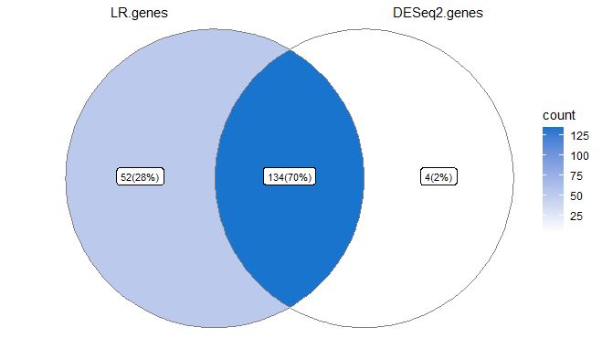
Note how 70% of genes overlap, but who are they? We can use information stored within the Venn object to identify overlaps. I would always default to pseudobulk gene testing, as in this manner differential count numbers across multiple datasets don’t affect your analysis, albeit this analysis can be very conservative. I personally prefer being conservative in the DE analysis.
# Look at all sets of genes forming overlaps
# https://github.com/yanlinlin82/ggvenn/issues/21
mylist <- data@region[["item"]]
names(mylist)
#OUTPUT
NULL
Mapping names onto data, and viewing lists. Note how 134 genes are overlapping both tests, whereas 52 are unique to LR and 4 are unique to DESeq2
names(mylist) <- data@region[["name"]]
mylist
#OUTPUT
$LR.genes
  [1] "RSAD2"    "OASL"     "PML"      "ETV7"     "DHX58"    "STAT2"    "DDX60"    "DEK"
  [9] "ZBP1"     "ZNFX1"    "GSDMD"    "MTHFD2"   "HSP90AA1" "ELF1"     "B3GNT2"   "NDUFA9"
 [17] "LACTB"    "AP3B1"    "DTX3L"    "TMEM140"  "GBP7"     "GLRX"     "SP140"    "TMX1"
 [25] "BAG1"     "TAP2.1"   "ZNF267"   "CNDP2"    "STAP1"    "CD53"     "HIF1A"    "MYCBP2"
 [33] "CHI3L2"   "GNB4"     "SYNE2"    "RARRES3"  "GPBP1"    "SNX6"     "CTSS"     "TANK"
 [41] "IDH3A"    "SOD2"     "MCL1"     "CAST"     "HLA-F"    "EVL"      "RNASEH2B" "UBE2F"
 [49] "ANXA2R"   "IRF2"     "SQRDL"    "TSPAN13"
$DESeq2.genes
[1] "HLA-B" "H3F3B" "HLA-C" "LAMP3"
$LR.genes..DESeq2.genes
  [1] "ISG15"     "ISG20"     "IFIT3"     "IFI6"      "IFIT1"     "MX1"       "TNFSF10"   "LY6E"
  [9] "IFIT2"     "B2M"       "CXCL10"    "PLSCR1"    "IRF7"      "HERC5"     "UBE2L6"    "IFI44L"
 [17] "EPSTI1"    "OAS1"      "GBP1"      "IFITM2"    "SAMD9L"    "NT5C3A"    "IFI35"     "PSMB9"
 [25] "MX2"       "DYNLT1"    "BST2"      "IFITM3"    "CMPK2"     "SAT1"      "EIF2AK2"   "PPM1K"
 [33] "GBP4"      "DDX58"     "PSMA2.1"   "LAP3"      "SAMD9"     "XAF1"      "IFI16"     "COX5A"
 [41] "SOCS1"     "MYL12A"    "SP110"     "PARP14"    "PSME2"     "TMSB10"    "CHST12"    "FBXO6"
 [49] "MT2A"      "PLAC8"     "TRIM22"    "DRAP1"     "SUB1"      "TNFSF13B"  "NMI"       "XRN1"
 [57] "NEXN"      "RBCK1"     "CLEC2D"    "MNDA"      "RNF213"    "IFI44"     "GBP5"      "NPC2"
 [65] "STAT1"     "WARS"      "OAS2"      "SELL"      "TAP1"      "DDX60L"    "IRF8"      "OAS3"
 [73] "RTCB"      "IFITM1"    "KIAA0040"  "CXCL11"    "CARD16"    "PSMA4"     "DNAJA1"    "IFIH1"
 [81] "TYMP"      "HLA-E"     "LGALS9"    "NUB1"      "C19orf66"  "GBP2"      "PSMB8"     "GNG5"
 [89] "HAPLN3"    "PMAIP1"    "IFIT5"     "PARP9"     "CD38"      "GMPR"      "C5orf56"   "EAF2"
 [97] "HERC6"     "CD48"      "RTP4"      "RABGAP1L"  "USP30-AS1" "TREX1"     "IGFBP4"    "INPP1"
[105] "CCL8"      "CREM"      "CD164"     "CLIC1"     "APOL6"     "CCL2"      "SMCHD1"    "ODF2L"
[113] "EHD4"      "NAPA"      "SP100"     "PHF11"     "FAM46A"    "PNPT1"     "ADAR"      "POMP"
[121] "UNC93B1"   "DCK"       "IRF1"      "CCR7"      "TMEM123"   "CASP4"     "HSH2D"     "SLFN5"
[129] "CFLAR"     "CASP1"     "VAMP5"     "PSME1"     "XBP1"      "MRPL44"
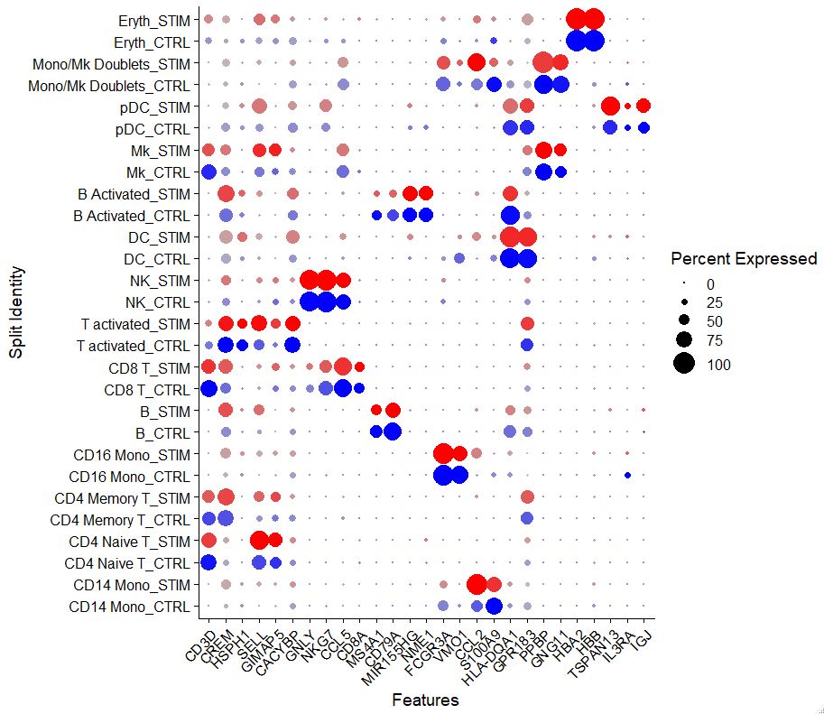
Another intuitive way in which we can visualize data is via a dotplot. Dotplots are great because you can visualize information across multiple samples for some select genes.
# Visualization via dotplot
Idents(pbmc) <- factor(Idents(pbmc), levels = c("Mono/Mk Doublets", "pDC", "Eryth",
                                                "Mk", "DC", "CD14 Mono", "CD16 Mono",
                                                "B Activated", "B", "CD8 T", "NK", "T activated",
                                                "CD4 Naive T", "CD4 Memory T"))
markers.to.plot <- c("CD3D", "CREM", "HSPH1", "SELL", "GIMAP5", "CACYBP", "GNLY", "NKG7", "CCL5",
                     "CD8A", "MS4A1", "CD79A", "MIR155HG", "NME1", "FCGR3A", "VMO1", "CCL2", "S100A9", "HLA-DQA1",
                     "GPR183", "PPBP", "GNG11", "HBA2", "HBB", "TSPAN13", "IL3RA", "IGJ")
Idents(pbmc) <- "celltype"
DotPlot(pbmc, features = markers.to.plot, cols = c("blue", "red"), dot.scale = 8, split.by = "stim") +
  RotatedAxis()
#OUTPUT
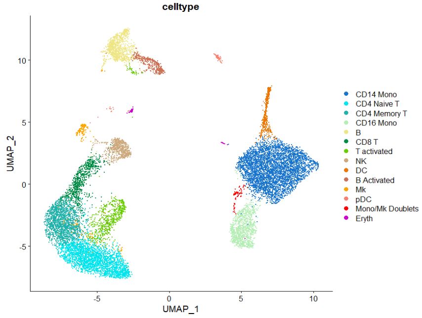
Some other cool tricks, involve changing the color organization in the UMAP plot, here just change the color sequence in the “cols” command to adjust the colors you want to visualize. Note how the colors match the sequence of clusters. If you want to learn more about colors in R look at this site for more info. Another way to select colors is using hexadecimal codes which can be picked by using this website, just replace the color names with your hexadecimal code of choice.
# Change colors on UMAP
DimPlot(pbmc, #switch here to plot
        #split.by = "Diabetes Status",
        group.by = "celltype",
        label = FALSE,
        ncol = 1,
        raster = FALSE,
        pt.size = 0.05,
        cols = c("dodgerblue3",
                 "turquoise2",
                 "lightseagreen",
                 "darkseagreen2",
                 "khaki2",
                 "springgreen4",
                 "chartreuse3",
                 "burlywood3",
                 "darkorange2",
                 "salmon3",
                 "orange",
                 "salmon",
                 "red",
                 "magenta3",
                 "orchid1",
                 "red4",
                 "grey30"
        )
)
#OUTPUT
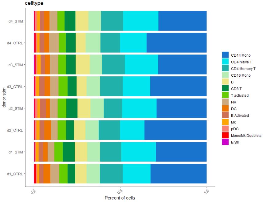
We can also look at cellular numbers across various cell types. These plots can be useful to add to QC, or if you are interested in looking at the diversity of your dataset.
# Look at cell proportion
pbmc$donor.stim <- paste(pbmc$donor, pbmc$stim, sep = "_")
table(pbmc$donor.stim)
#OUTPUT

     B Activated_CTRL      B Activated_STIM                B_CTRL                B_STIM        CD14 Mono_CTRL
                  183                   207                   405                   565                  2209
       CD14 Mono_STIM        CD16 Mono_CTRL        CD16 Mono_STIM     CD4 Memory T_CTRL     CD4 Memory T_STIM
                 2114                   518                   546                   813                   903
     CD4 Naive T_CTRL      CD4 Naive T_STIM            CD8 T_CTRL            CD8 T_STIM               DC_CTRL
                 1003                  1475                   320                   466                   226
              DC_STIM            Eryth_CTRL            Eryth_STIM               Mk_CTRL               Mk_STIM
                  194                    22                    33                    98                   122
Mono/Mk Doublets_CTRL Mono/Mk Doublets_STIM               NK_CTRL               NK_STIM              pDC_CTRL
                   42                    28                   312                   333                    51
             pDC_STIM      T activated_CTRL      T activated_STIM
                   77                   315                   343
# Let's make a bar plot of cellular proportion
dittoBarPlot(pbmc, "celltype",
             retain.factor.levels = TRUE,
             scale = "percent",
             color.panel = c("dodgerblue3",
                             "turquoise2",
                             "lightseagreen",
                             "darkseagreen2",
                             "khaki2",
                             "springgreen4",
                             "chartreuse3",
                             "burlywood3",
                             "darkorange2",
                             "salmon3",
                             "orange",
                             "salmon",
                             "red",
                             "magenta3",
                             "orchid1",
                             "red4",
                             "grey30"),
             group.by = "donor.stim") + coord_flip()
#OUTPUT
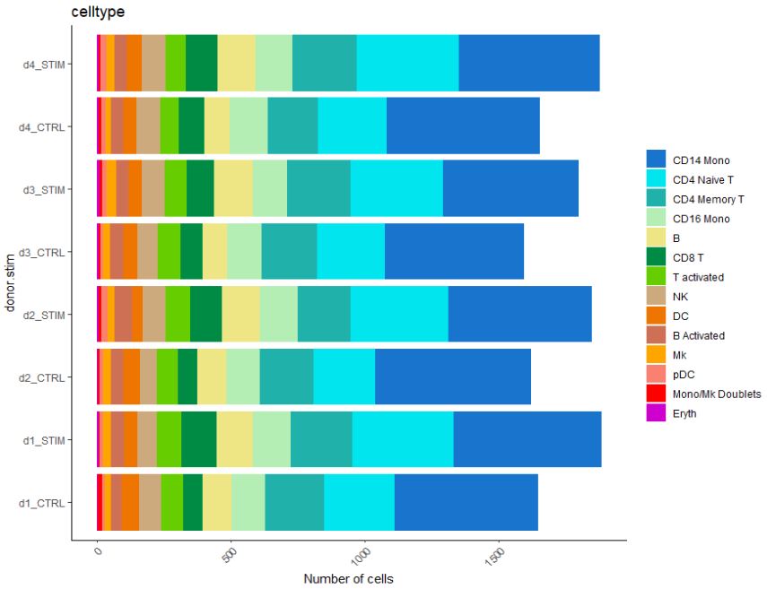
Similarly, we can look at the total cell number.
# Or even cellular number
dittoBarPlot(pbmc, "celltype",
             retain.factor.levels = TRUE,
             scale = "count",
             color.panel = c("dodgerblue3",
                             "turquoise2",
                             "lightseagreen",
                             "darkseagreen2",
                             "khaki2",
                             "springgreen4",
                             "chartreuse3",
                             "burlywood3",
                             "darkorange2",
                             "salmon3",
                             "orange",
                             "salmon",
                             "red",
                             "magenta3",
                             "orchid1",
                             "red4",
                             "grey30"),
             group.by = "donor.stim") + coord_flip()
#OUTPUT
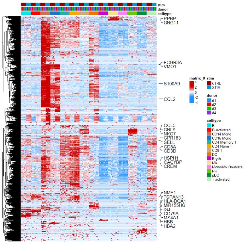
Heatmaps are really intuitive methods to look at a variety of genes, this customized heatmap is based on the dittoHeatmap package. Note how we are looking at the pseudobulked data to generate a heatmap.
# Heatmap
label_genes <- c("CD3D", "CREM", "HSPH1", "SELL", "GIMAP5", "CACYBP", "GNLY", "NKG7", "CCL5",
                 "CD8A", "MS4A1", "CD79A", "MIR155HG", "NME1", "FCGR3A", "VMO1", "CCL2", "S100A9", "HLA-DQA1",
                 "GPR183", "PPBP", "GNG11", "HBA2", "HBB", "TSPAN13", "IL3RA", "IGJ")
genes.to.plot <- pbmc@assays[["RNA"]]@var.features
dittoHeatmap(
  combined_pbmc,
  genes = genes.to.plot,
  # metas = NULL,
  # cells.use = NULL,
  annot.by = c("celltype", "donor", "stim"),
  #annot.by = c("lib", "sex", "source"),
  order.by = c("celltype"),
  # main = NA,
  # cell.names.meta = NULL,
  # assay = .default_assay(object),
  # slot = .default_slot(object),
  # swap.rownames = NULL,
  heatmap.colors = colorRampPalette(c("dodgerblue", "white", "red3"))(50),
  breaks=seq(-2, 2, length.out=50),
  scaled.to.max = FALSE,
  # heatmap.colors.max.scaled = colorRampPalette(c("white", "red"))(25),
  # annot.colors = c(dittoColors(), dittoColors(1)[seq_len(7)]),
  # annotation_col = NULL,
  annotation_colors = list(celltype = c("CD14 Mono" = "salmon3",
                                        "CD4 Naive T" = "orange",
                                        "CD4 Memory T"= "lightseagreen",
                                        "CD16 Mono" = "dodgerblue3",
                                        "B" = "turquoise2",
                                        "CD8 T" = "burlywood3",
                                        "T activated" = "darkseagreen2",
                                        "NK" = "chartreuse3",
                                        "DC" = "darkorange2",
                                        "B Activated" = "red",
                                        "Mk" = "khaki2",
                                        "pDC" = "springgreen4",
                                        "Mono/Mk Doublets" = "orchid1",
                                        "Eryth" = "magenta3"),
                           donor = c("d1" = "dodgerblue",
                                     "d2" = "red2",
                                     "d3" = "green3",
                                     "d4" = "purple2"),
                           stim = c("CTRL" = "red4",
                                    "STIM" = "deepskyblue3")),
                           # ancestry = c("white" = "deepskyblue3",
                           #              "black" = "black",
                           #              "hispanic" = "darkorange"),
                           # source = c("nPOD" = "dodgerblue",
                           #            "Tulane" = "springgreen4",
                           #            "UPENN" = "red4")),
  # # data.out = FALSE,
  # highlight.features = NULL,
  # highlight.genes = NULL,
  # show_colnames = isBulk(object),
  # show_rownames = TRUE,
  # scale = "row",
  #cluster_cols = TRUE,
  # border_color = NA,
  # legend_breaks = NA,
  # drop_levels = FALSE,
  # breaks = NA,
  # complex = FALSE
  #gaps_col = c(460),
  complex = TRUE,
  use_raster = TRUE,
  raster_quality = 5
) + rowAnnotation(mark = anno_mark(at = match(label_genes,
                                              rownames(pbmc[genes.to.plot,])),
                                   labels = label_genes,
                                   which = "row",
                                   labels_gp = list(cex=1),
                                   #link_width = unit(4, "mm"), link_height = unit(4, "mm"),
                                   padding = 0.1))
#OUTPUT
It seems you are using RStudio IDE. `anno_mark()` needs to work with the physical size of the graphics
device. It only generates correct plot in the figure panel, while in the zoomed plot (by clicking the icon
'Zoom') or in the exported plot (by clicking the icon 'Export'), the connection to heatmap rows/columns might
be wrong. You can directly use e.g. pdf() to save the plot into a file.

Use `ht_opt$message = FALSE` to turn off this message.
Warning message:
It not suggested to both set `scale` and `breaks`. It makes the function confused.