Multidimensional reduction and cell clustering
STEP10 Linear dimensionality reduction
Reducing data is important so that we can visualize it in a 2-dimensional plane. Read this paper by Lever et al., 2017: Nature Methods to read more about principal component analysis.
pbmc <- RunPCA(pbmc, pc.genes = pbmc@assays$RNA@var.features, npcs = 20, verbose = TRUE)
#OUTPUT
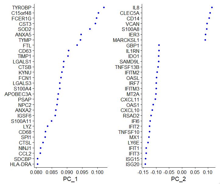
PC_ 1
Positive: TYROBP, C15orf48, FCER1G, CST3, SOD2, ANXA5, TYMP, FTL, CD63, TIMP1
LGALS1, CTSB, KYNU, FCN1, LGALS3, S100A4, APOBEC3A, PSAP, NPC2, ANXA2
IGSF6, S100A11, LYZ, CD68, SPI1, CTSL, NINJ1, CCL2, SDCBP, HLA-DRA
Negative: CCR7, LTB, GIMAP7, CD3D, CD7, SELL, CD2, TRAT1, IL7R, CLEC2D
PTPRCAP, ITM2A, IL32, RHOH, RGCC, LEF1, CD3G, ALOX5AP, CD247, CREM
PASK, TSC22D3, SNHG8, MYC, GPR171, BIRC3, NOP58, CD27, CD8B, SRM
PC_ 2
Positive: IL8, CLEC5A, CD14, VCAN, S100A8, IER3, MARCKSL1, IL1B, PID1, CD9
GPX1, PLAUR, INSIG1, PHLDA1, PPIF, THBS1, S100A9, GAPDH, OSM, LIMS1
SLC7A11, GAPT, ACTB, CTB-61M7.2, ENG, CEBPB, OLR1, CXCL3, FTH1, MGST1
Negative: ISG20, ISG15, IFIT3, IFIT1, LY6E, MX1, TNFSF10, IFIT2, IFI6, RSAD2
CXCL10, OAS1, CXCL11, MT2A, IFITM3, IRF7, OASL, IFITM2, TNFSF13B, SAMD9L
IDO1, IL1RN, GBP1, CMPK2, CCL8, DDX58, APOBEC3A, PLSCR1, GBP4, FAM26F
PC_ 3
Positive: HLA-DQA1, CD83, HLA-DQB1, CD74, HLA-DPA1, HLA-DRA, HLA-DPB1, HLA-DRB1, SYNGR2, IRF8
CD79A, MS4A1, HERPUD1, MIR155HG, HLA-DMA, REL, TVP23A, HSP90AB1, ID3, TSPAN13
FABP5, CCL22, BLNK, EBI3, TCF4, PMAIP1, PRMT1, NME1, SPIB, HVCN1
Negative: ANXA1, GIMAP7, CD3D, CD7, CD2, RARRES3, MT2A, IL32, GNLY, CCL2
PRF1, CD247, S100A9, TRAT1, RGCC, CCL7, NKG7, CCL5, CTSL, HPSE
S100A8, CCL8, CD3G, ITM2A, KLRD1, GZMH, GZMA, CTSW, OASL, GPR171
PC_ 4
Positive: CCR7, LTB, SELL, LEF1, IL7R, ADTRP, TRAT1, PASK, MYC, SOCS3
CD3D, TSC22D3, HSP90AB1, TSHZ2, GIMAP7, SNHG8, TARBP1, CMTM8, PIM2, HSPD1
CD3G, GBP1, TXNIP, RHOH, BIRC3, C12orf57, PNRC1, CA6, CD27, CMSS1
Negative: NKG7, GZMB, GNLY, CST7, CCL5, PRF1, CLIC3, KLRD1, GZMH, GZMA
APOBEC3G, CTSW, FGFBP2, KLRC1, FASLG, C1orf21, HOPX, CXCR3, SH2D1B, LINC00996
TNFRSF18, SPON2, RARRES3, GCHFR, SH2D2A, IGFBP7, ID2, C12orf75, XCL2, S1PR5
PC_ 5
Positive: CCL2, CCL7, CCL8, PLA2G7, LMNA, TXN, S100A9, SDS, CSTB, CAPG
EMP1, CCR1, IDO1, CCR5, MGST1, SLC7A11, FABP5, LILRB4, GCLM, HSPA1A
CTSB, VIM, PDE4DIP, CCNA1, HPSE, LYZ, RSAD2, SGTB, FPR3, CREG1
Negative: VMO1, FCGR3A, MS4A4A, MS4A7, CXCL16, PPM1N, HN1, LST1, SMPDL3A, CDKN1C
CASP5, ATP1B3, CH25H, AIF1, PLAC8, SERPINA1, LRRC25, GBP5, CD86, HCAR3
RGS19, RP11-290F20.3, COTL1, VNN2, C3AR1, LILRA5, STXBP2, PILRA, ADA, FCGR3B
Now let’s visualize the PCA outputs to see how individual components are being affected by which set of genes
# Visualize PCA
VizDimLoadings(pbmc, dims = 1:2, reduction = "pca")
#OUTPUT
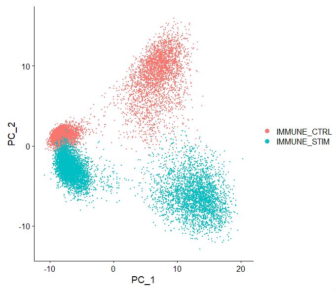
Now let’s look at the output of how cells cluster based on the pca, note the batch effect, as the two sets of data seem to “shift” away from one another. We will need to batch-correct this data, you will see why at a later point.
DimPlot(pbmc, reduction = "pca")
#OUTPUT
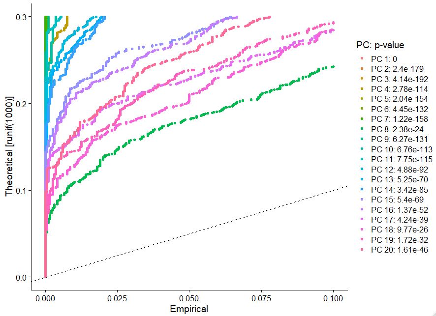
determining clustering in your sc data can be very complex. We can use some intuitive tools embedded in Seurat’s framework to allow us to make reasonable decisions regarding clustering. One such example is to use Jackstraw plots (note this step takes some time to run) you want to look for an inflection point where there are big differences in the p-value.
# Determine dimensionality of the dataset
# NOTE: This process can take a long time for big datasets, comment out for expediency. More
# approximate techniques such as those implemented in ElbowPlot() can be used to reduce
# computation time
pbmc <- JackStraw(pbmc, num.replicate = 100)
pbmc <- ScoreJackStraw(pbmc, dims = 1:20)

# When I say comment out that means use # because whenever # is present that peice of syntax will not run in R, R will assume its just a comment/annotation
#OUTPUT
|++++++++++++++++++++++++++++++++++++++++++++++++++| 100% elapsed=05m 07s
|++++++++++++++++++++++++++++++++++++++++++++++++++| 100% elapsed=00s
JackStrawPlot(pbmc, dims = 1:20)
#OUTPUT
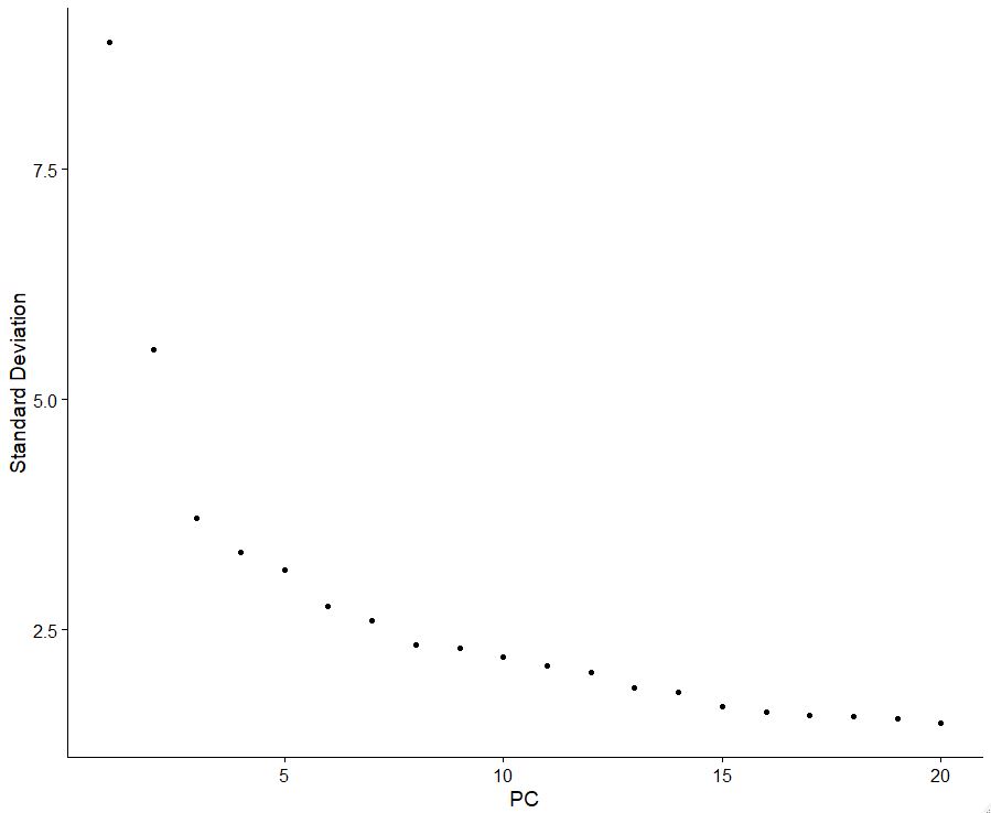
Similar to the jackstraw plot, we can also look at the pca elbow plot, which will help us understand how to decide which PCA to use. Here we use an inflection point or “elbow” to decide which pca to use.
# Visualize elbow plot of PC
ElbowPlot(pbmc)
#OUTPUT
STEP11 Batch correction using Harmony
This is the most important yet challenging aspect. Batch correction. If your data are not appropriately batch corrected, you could make incorrect assumptions purely due to library composition bias or sequencing type, or even treatment in this case. We will demonstrate this later, but for now let’s run Harmony to adjust for batch, using donor and stimulation metadata as covariates in our batch correction design model.
#Run Harmony batch correction with library and tissue source covariates
pbmc <- RunHarmony(pbmc,
                   assay.use = "RNA",
                   reduction = "pca",
                   dims.use = 1:20,
                   group.by.vars = c("donor", "stim"),
                   kmeans_init_nstart=20, kmeans_init_iter_max=100,
                   plot_convergence = TRUE)
#OUTPUT
Harmony 1/10
0%   10   20   30   40   50   60   70   80   90   100%
[----|----|----|----|----|----|----|----|----|----|
**************************************************|
Harmony 2/10
0%   10   20   30   40   50   60   70   80   90   100%
[----|----|----|----|----|----|----|----|----|----|
**************************************************|
Harmony 3/10
0%   10   20   30   40   50   60   70   80   90   100%
[----|----|----|----|----|----|----|----|----|----|
**************************************************|
Harmony 4/10
0%   10   20   30   40   50   60   70   80   90   100%
[----|----|----|----|----|----|----|----|----|----|
**************************************************|
Harmony 5/10
0%   10   20   30   40   50   60   70   80   90   100%
[----|----|----|----|----|----|----|----|----|----|
**************************************************|
Harmony 6/10
0%   10   20   30   40   50   60   70   80   90   100%
[----|----|----|----|----|----|----|----|----|----|
**************************************************|
Harmony 7/10
0%   10   20   30   40   50   60   70   80   90   100%
[----|----|----|----|----|----|----|----|----|----|
**************************************************|
Harmony 8/10
0%   10   20   30   40   50   60   70   80   90   100%
[----|----|----|----|----|----|----|----|----|----|
**************************************************|
Harmony 9/10
0%   10   20   30   40   50   60   70   80   90   100%
[----|----|----|----|----|----|----|----|----|----|
**************************************************|
Harmony converged after 9 iterations
Warning: Invalid name supplied, making object name syntactically valid. New object name is Seurat..ProjectDim.RNA.harmony; see ?make.names for more details on syntax validity
#OUTPUT
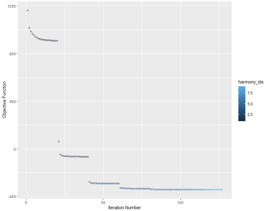
Congrats your objective function has converged!
STEP12 Nonlinear multidimensional projection using UMAP
Now we will perform hypergeometric multidimensional data projection, using UMAP. To read more about UMAP visit this website.
# Run UMAP, on PCA NON-batch corrected data
pbmc <- RunUMAP(pbmc, reduction = "pca", dims = 1:20, return.model = TRUE)
#OUTPUT
Warning: The default method for RunUMAP has changed from calling Python UMAP via reticulate to the R-native UWOT using the cosine metric
To use Python UMAP via reticulate, set umap.method to 'umap-learn' and metric to 'correlation'
This message will be shown once per session
UMAP will return its model
12:48:28 UMAP embedding parameters a = 0.9922 b = 1.112
12:48:28 Read 13923 rows and found 20 numeric columns
12:48:28 Using Annoy for neighbor search, n_neighbors = 30
12:48:28 Building Annoy index with metric = cosine, n_trees = 50
0%   10   20   30   40   50   60   70   80   90   100%
[----|----|----|----|----|----|----|----|----|----|
**************************************************|
12:48:29 Writing NN index file to temp file C:\Users\mqadir\AppData\Local\Temp\RtmpqizHXk\file4f6c49d77599
12:48:29 Searching Annoy index using 1 thread, search_k = 3000
12:48:32 Annoy recall = 100%
12:48:33 Commencing smooth kNN distance calibration using 1 thread with target n_neighbors = 30
12:48:34 Initializing from normalized Laplacian + noise (using irlba)
12:48:34 Commencing optimization for 200 epochs, with 598286 positive edges
Using method 'umap'
0%   10   20   30   40   50   60   70   80   90   100%
[----|----|----|----|----|----|----|----|----|----|
**************************************************|
12:48:46 Optimization finished
# Lets look at the batch effect when we don't integrate our data
DimPlot(pbmc, reduction = 'umap', label = FALSE, pt.size = 2, raster=TRUE)
#OUTPUT
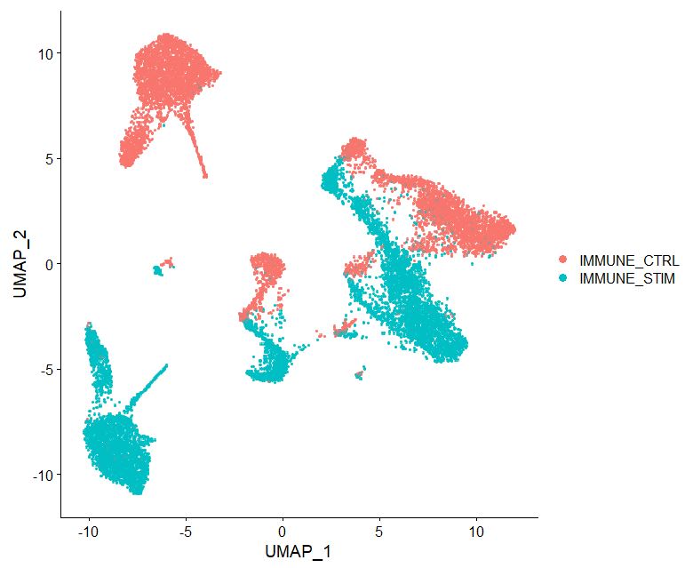
In the figure above, we are viewing what the data will look like if we do not perform batch correction via harmony. Notice how the two datasets although looking similar appear to be a reflection on one another. This demonstrates poor batch correction and needs to be accounted for. We will now correct this, using Harmony-corrected coordinates.
# Now run Harmony
pbmc <- RunUMAP(pbmc, reduction = "harmony", dims = 1:20, return.model = TRUE)
#OUTPUT
UMAP will return its model
12:52:56 UMAP embedding parameters a = 0.9922 b = 1.112
12:52:56 Read 13923 rows and found 20 numeric columns
12:52:56 Using Annoy for neighbor search, n_neighbors = 30
12:52:56 Building Annoy index with metric = cosine, n_trees = 50
0%   10   20   30   40   50   60   70   80   90   100%
[----|----|----|----|----|----|----|----|----|----|
**************************************************|
12:52:57 Writing NN index file to temp file C:\Users\mqadir\AppData\Local\Temp\RtmpqizHXk\file4f6c2a32094
12:52:57 Searching Annoy index using 1 thread, search_k = 3000
12:53:00 Annoy recall = 100%
12:53:01 Commencing smooth kNN distance calibration using 1 thread with target n_neighbors = 30
12:53:03 Initializing from normalized Laplacian + noise (using irlba)
12:53:03 Commencing optimization for 200 epochs, with 603016 positive edges
Using method 'umap'
0%   10   20   30   40   50   60   70   80   90   100%
[----|----|----|----|----|----|----|----|----|----|
**************************************************|
12:53:14 Optimization finished
DimPlot(pbmc, reduction = 'umap', label = FALSE, pt.size = 2, raster=TRUE)
#OUTPUT
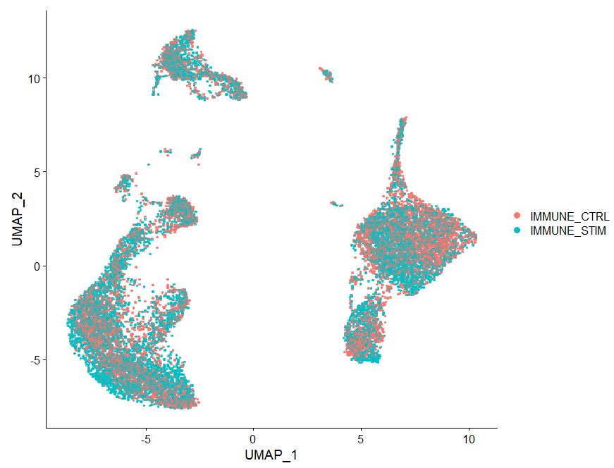
Note in the plot above how cells from two treatments are intermixed, we have removed the batch effect due to treatment from this dataset.
STEP13 Clustering
Now we want to cluster our data, so that we can visualize various cell types.
# Algorithm 3 is the smart local moving (SLM) algorithm https://link.springer.com/article/10.1140/epjb/e2013-40829-0
pbmc <- pbmc %>%
  FindNeighbors(reduction = 'harmony', dims = 1:20) %>%
  FindClusters(algorithm=3,resolution = c(0.5), method = 'igraph') #25 res
#OUTPUT
Computing nearest neighbor graph
Computing SNN
Modularity Optimizer version 1.3.0 by Ludo Waltman and Nees Jan van Eck

Number of nodes: 13923
Number of edges: 490868

Running smart local moving algorithm...
0%   10   20   30   40   50   60   70   80   90   100%
[----|----|----|----|----|----|----|----|----|----|
**************************************************|
Maximum modularity in 10 random starts: 0.8967
Number of communities: 14
Elapsed time: 8 seconds
Let’s first see the data annotations based on Seurat’s pre-computed information. Seurat uses its own methodology for dataset integration, so this is a good time to see if our batch correction matches theirs.
Idents(pbmc) <- "seurat_annotations"
DimPlot(pbmc, reduction = "umap", label = TRUE)
#OUTPUT
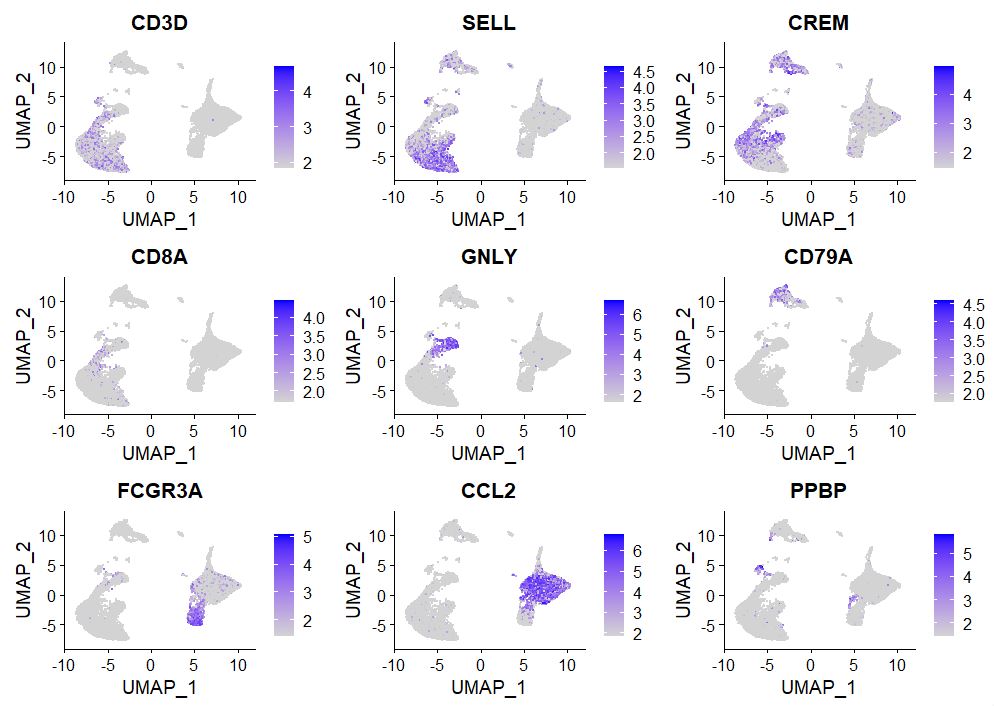
Visualizing gene expression is the most basic yet intuitive method of allocating cellular identity, no one knows the biology of your cell type more than you, so use your cell type-specific markers to allocate notations on various clusters.
# Observe gene expression
FeaturePlot(pbmc, features = c("CD3D", "SELL", "CREM", "CD8A", "GNLY", "CD79A", "FCGR3A",
                               "CCL2", "PPBP"), min.cutoff = "q9")
#OUTPUT
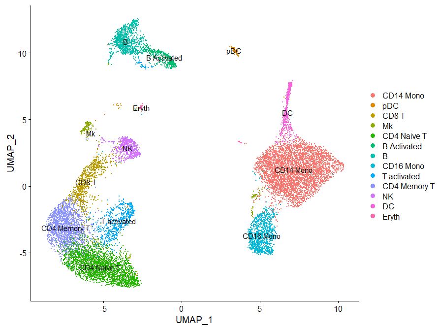
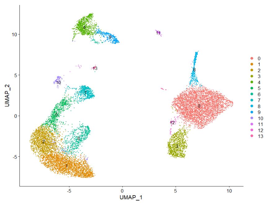
Now based on this information, we want to go ahead and rename our clusters, matching gene expression based on known PBMC RNA expression.
# Rename clusters
Idents(pbmc) <- "RNA_snn_res.0.5"
table(pbmc@meta.data[["RNA_snn_res.0.5"]])
#OUTPUT
   0    1    2    3    4    5    6    7    8    9   10   11   12   13
4323 2478 1716 1064  970  786  658  645  420  390  220  128   70   55
DimPlot(pbmc, reduction = "umap", label = TRUE)
#OUTPUT
new.cluster.ids <- c("CD14 Mono", "CD4 Naive T", "CD4 Memory T", "CD16 Mono",
                     "B", "CD8 T", "T activated", "NK", "DC", "B Activated",
                     "Mk", "pDC", "Mono/Mk Doublets", "Eryth")
names(new.cluster.ids) <- levels(pbmc)
pbmc <- RenameIdents(pbmc, new.cluster.ids)
DimPlot(pbmc, reduction = "umap", label = TRUE, pt.size = 0.5) + NoLegend()
#OUTPUT
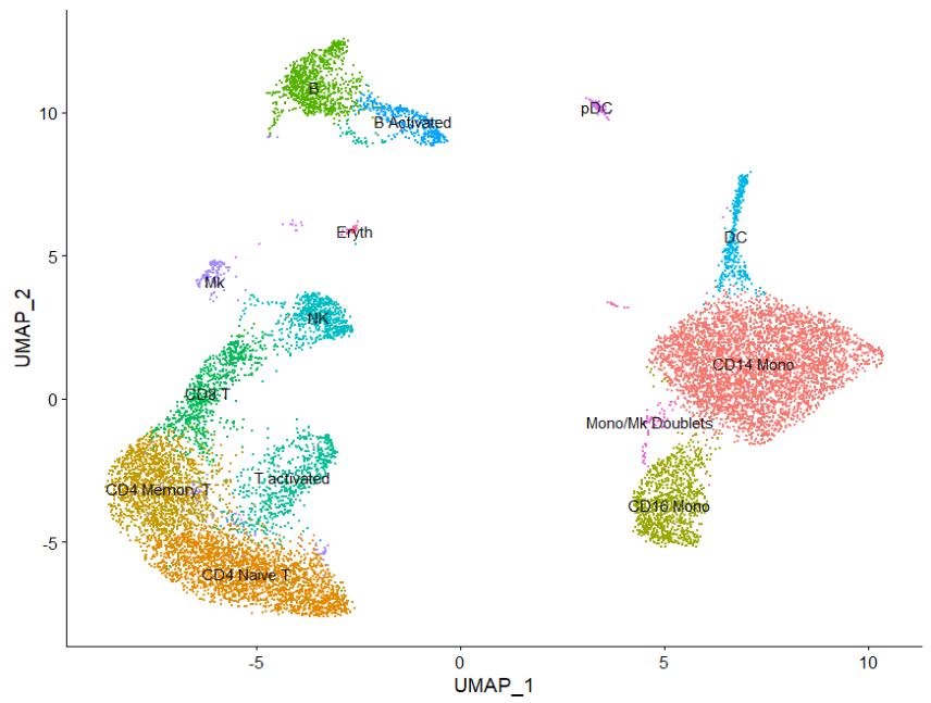
Congrats! You have clustered and annotated cells based on celltype. Where is this data stored btw?